
Digital Factory : CMS, Site Web, Intranet Entreprise
Digital Factory
Emencia, depuis sa création en 2002, est spécialisée dans la gestion de contenu (CMS) et la création de sites web. Nous proposons un service 360° autour de votre communication web. Afin de garantir la mise en place de sites web d'entreprise, design, robuste, évolutif et sécurisé, nous avons développé notre expertise sur le framework Django Python. Ainsi nous proposons pour les sites web complexes l'utilisation des CMS suivants :
Nous pouvons vous accompagner dans la création de :
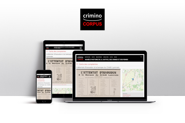
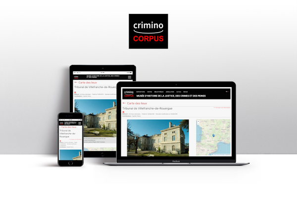
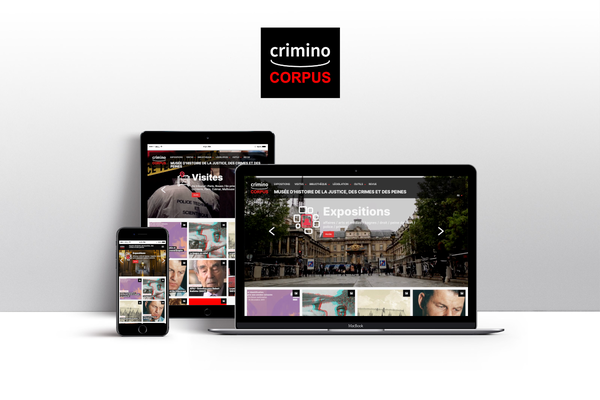
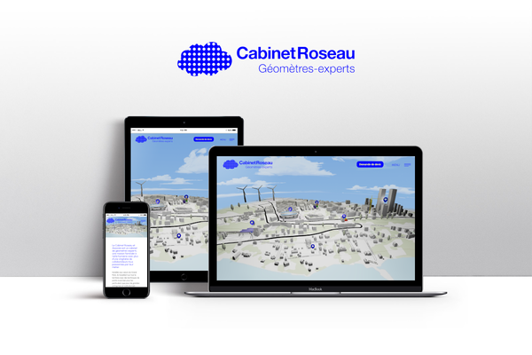
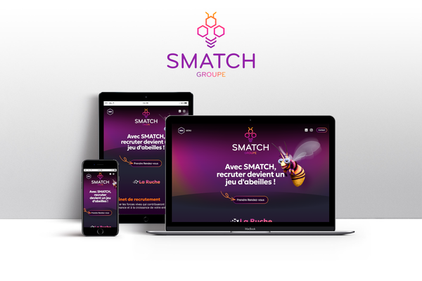
Site Web sur mesure / CMS / Landing Page
Nous proposons la création de site Internet sur mesure, Site de communication, Portail d'entreprise avec Django CMS ou Wagtail.
La mise en place d'un site Internet, permet le renforcement de l'image de marque de l'entreprise en offrant un accès convivial aux informations et aux outils nécessaires
Landing Page
La création d'une landing page offre une captation ciblée des visiteurs, une meilleure expérience utilisateur et une augmentation des conversions. Elle collecte des données précieuses, optimise la visibilité en ligne et sert de point d'entrée pour des campagnes publicitaires ciblées, maximisant ainsi les résultats marketing et stimulant la croissance de l'entreprise.
Portail d'Entreprise
La création d'un portail d'entreprise présente de nombreux avantages : centralisation des informations et des ressources internes, renforcement de la communication interne et facilitation de la gestion des processus internes. De plus, il renforce l'image de marque de l'entreprise en offrant un accès convivial aux informations et aux outils nécessaires.
Usines à site pour un regoupement d'entreprise
Elle présente l'avantage d'avoir une plateforme centralisée facilitant la gestion et la mise à jour des sites, réduisant ainsi les coûts et les efforts. Elle renforce également l'image de marque en offrant une cohérence visuelle et la possibilité de partager des ressources communes, favorisant ainsi la collaboration. De plus, elle offre une flexibilité et une évolutivité accrues pour faciliter la croissance et la gestion efficace de l'ensemble des sites. L'Usine à site est un outil essentiel pour optimiser la gestion web, renforcer l'image de marque et faciliter la collaboration au sein du regroupement d'entreprises.
Intranet d'entreprise
Un intranet d'entreprise est une plateforme en ligne privée qui facilite la communication interne, la collaboration et la gestion des ressources. Il permet de diffuser des informations importantes, de partager des documents et de coordonner les efforts entre les membres de l'entreprise. De plus, il facilite la communication hiérarchique et offre un espace social pour favoriser l'interaction et renforcer la culture d'entreprise. En somme, un intranet d'entreprise améliore l'efficacité organisationnelle, la transparence et favorise l'engagement des employés.
Site E-commerce (Btob / BtoC)
Un site E-commerce offre une portée mondiale, des coûts réduits, des opportunités de personnalisation et de marketing, ainsi qu'une meilleure expérience client, ce qui en fait un moyen efficace de vendre des produits et des services en ligne et de développer votre entreprise. Nous proposons de réaliser votre site E-commerce avec Prestashop ou Magento, des solutions open source, leader du marché, permettant de vous offrir une autonomie sur le catalogue et le suivi de vos ventes.
Plateforme digitale métier sur mesure
Une plateforme digitale métier sur mesure centralise et rationalise les processus spécifiques d'une entreprise, améliorant ainsi son efficacité opérationnelle. Elle facilite la collecte, la gestion et l'analyse des données, automatisant les tâches répétitives et augmentant la productivité. De plus, elle offre une expérience utilisateur personnalisée et intuitive, répondant aux besoins spécifiques des utilisateurs finaux. Enfin, elle favorise l'innovation et l'agilité de l'entreprise, s'adaptant aux changements et aux évolutions de l'environnement. Nous pouvons vous accompagner sur le développement sur mesure de votre application métier.
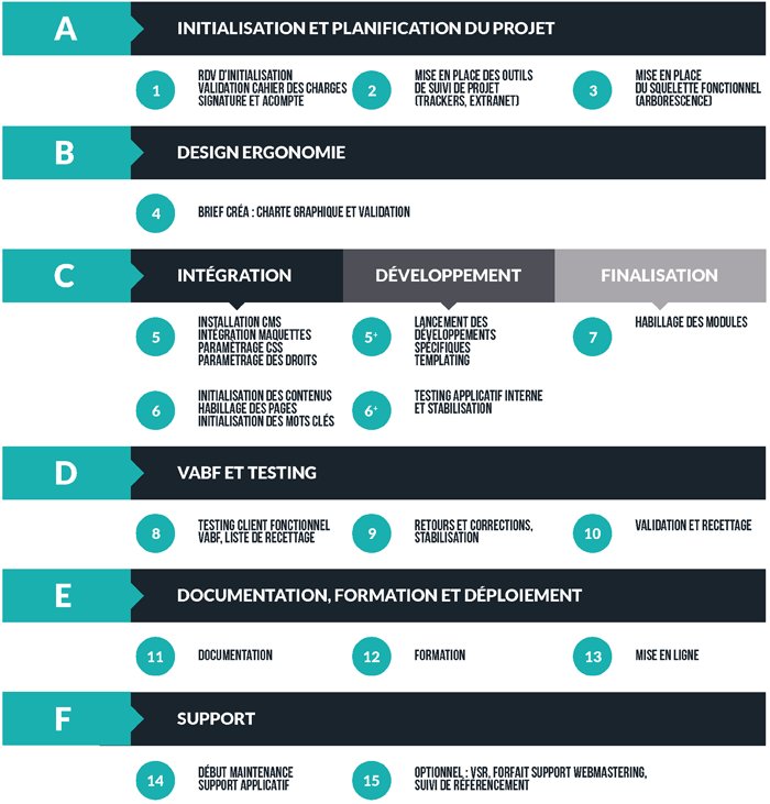
Fonctionnement du processus de création de votre application web
Ce schéma permet de comprendre les différentes étapes et les équipes impliquées dans tout le processus de création de votre application web.
Emencia fournit une assistance à chaque étape de votre projet web.
Nos CMS préférés pour faire de vos projets un succès
Django CMS
Django CMS est un système de gestion de contenu sous licence BSD basé sur le fameux serveur Django / Python. Simple d'utilisation, il dispose d'une interface intuitive en drag & drop permettant de gérer facilement l'arborescence et la publication de contenus via ses extensions.
Django CMS propose en standard de gérer le multilingue, le versionning, les workflows de publication, les permissions la publication multi-sites. Enfin Django CMS a été conçu dès le départ pour être optimisé pour le référencement naturel (SEO Friendly).
Plus d'infos sur : www.django-cms.org
Les fonctionnalités majeures de Django CMS

De nombreux modules
Construisez des pages flexibles avec un grand choix de modules : WYSIWYG, texte, images, liens, fichiers, news, Map, vidéos, news, jobs, Slider, album photos, CMS plugin blocks (pour une mise en forme avancée), ...

Workflow de la publication
Vous pouvez contrôler les étapes d'approbation et de publication des contenus

Gestion des permissions
Réglez les droits et permissions des différents utilisateurs

Versioning
Si vos modifications en mode édition ne sont pas satisfaisantes, vous pouvez revenir à la version de la page publiée.

Multisites
Administrez plusieurs sites depuis la même interface de gestion.

Optimisation SEO
La structure des pages est optimisée pour le référencement

Applications - une architecture modulaire
Ajoutez des applications spécifiques à chaque page du CMS.

MAM - Media Asset Manager
MAM vous permet de gérer toutes sortes de formats (images, PDF, vidéos et autres documents...)

Des applications métiers
Nous avons développé des applications métiers (module Django CMS), pour permettre à nos clients de gérer les offres d'emploi, les candidatures spontanées.
Nous proposons également d'autres modules : gestion d'articles avancée, trombinoscope, gestion d'événements, Albums photos privés, ....
Wagtail CMS
Wagtail est un système de gestion de contenu (CMS) open source écrit en Python. C'est un CMS populaire utilisant le framework Django.
Wagtail offre une solide expérience éditoriale
Le projet est maintenu par une équipe de contributeurs open-source soutenue par des entreprises à travers le monde.
Le projet se concentre sur la facilité d'accès pour les développeurs (ajout de nouvelles fonctionnalités, multilingue etc..) ainsi que sur la facilité d'utilisation de son interface d'administration pour les utilisateurs finaux.
Les avantages de Wagtail CMS
Nous déployons Wagtail CMS pour de grands groupes qui ont besoins de gestion de contenu avancés et cadrés. En effet Wagtail CMS présente l'avantage d'avoir par défaut un système de workflow de publication et de permissions avancés, tout en offrant un cadre aux contributeurs. La gestion multilingue, et la robustesse ont font un CMS orienté entreprise de premier choix.

Flexibilité pour les développeurs
Wagtail propose une architecture modulaire et permet de faire évoluer le contenu à l'échelle de l'entreprise

Python et Django sous le capot
Wagtail CMS est construit sur le framework Django / Python. Tout ce qui est faisable en python ou Django, peut être branché dans Wagtail.
Le frontend offre de nombreuses libertés aux designers.

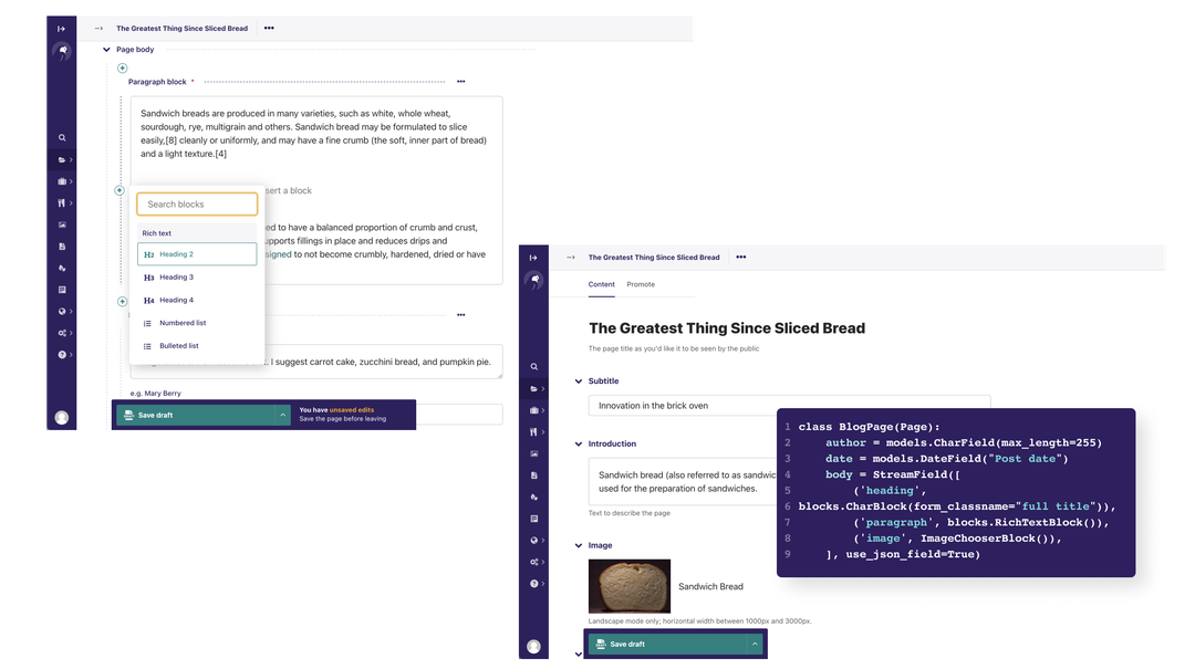
Streamfield : une gestion de contenus avancée
L'interface Wagtail StreamField est intuitive et donne aux éditeurs un contrôle créatif sur le contenu.

Pas de licence et une communauté de professionnels
Wagtail n'a pas de licence (No Lock-in) et ils existe une communauté de professionnels, vous garantissant une réversibilité. Pas de menottes numériques sur une plateforme propriétaire dont vous n'avez pas les codes sources.

Un back office simple et intuitif
Les éditeurs peuvent structurer et publier le contenu comme ils le souhaitent sans développeur.

Des grands groupes utilisent Wagtail CMS
Un CMS approuvé par les organisations que vous connaissez : NASA, OXFAM, MOZILLA, MIT, Google, NHS, Moêt Hennesy, Royal College of Art, ...
Votre site E-commerce avec Shopify
Créée en 2006, Shopify est la nouvelle plateforme référence de e-commerce.
Que ce soit pour des petites structures ou des marques de statut international, Shopify est la solution pour développer une boutique de vente en ligne simple d'utilisation, rapide et fiable.
Une solution populaire et fiable
Environ 29 % des sites web qui ont recours au e-commerce utilisent Shopify, notamment Pepsi, Tesla Motors et Redbull.
Un hébergement simplifié
Une solution clé en main, hébergée par Shopify.
Une personnalisation facile
Une centaine de thèmes officiels ainsi que des milliers d’applications disponibles directement sur les stores Shopify pour étendre les fonctionnalités de votre boutique.
Des solutions de paiement intégrées
Shopify Payments préinstallé permettant aux utilisateurs de régler leurs achats sur votre site par carte bancaire.
Les fonctionnalités clés incluses dans Shopify

Formulaire de contact

Produits simples, configurables et virtuels

Blog

Gestion des points de vente

Promotions et codes de réduction

Statistiques des visites et des ventes

Moteur de recherche

Terminal de paiement
Votre site E-commerce avec Prestashop
PrestaShop est une application Web open source permettant de créer une boutique en ligne dans le but de réaliser du commerce électronique. L'application est publiée selon les termes de la licence Open Software 3.0. PrestaShop est aussi le nom de la société éditrice de cette solution.
"Plus de 300 000 marchands utilisent déjà PrestaShop"
Soucieux de répondre aux mieux aux attentes de ses clients, Emencia s'est penchée sur une solution alternative intégrant les fonctionnalités essentielles à la tenue efficace d'une boutique en ligne :
- gestion des clients
- gestion des produits
- gestion de catalogue
- statistiques de ventes
- inscription newsletter
- gestion de contenu (pages, actualités)
- gestion des promotions et coupons
- gestion des livraisons
- gestion des TVA
- paiement sécurisés
- etc.
Prestashop Edition, la nouvelle solution clé en main
PrestaShop Edition vous propose une solution avec hébergement, assistance en illimité et tous les services indispensables à la création et à la croissance de votre boutique en ligne.
Paiement, livraison, marketing, statistiques, conformité légale, etc. Tous les indispensables aux besoins d'un site e-commerce sont déjà pré-installés sur votre boutique.
Plus d'infos sur : www.prestashop.com
Les avantages de Prestashop

Choisir une solution professionnelle, clé en main

Un CMS évolutif et pérenne
Une personnalisation sans limite

Des coûts maîtrisés et sans surprise

Des capacités SEO natives

Des outils de mesure performants

Prêt pour se lancer à l’international

Une solution avec outils marketing intégrés

Une assistance et un accompagnement personnalisés

Conforme aux obligations légales

Une architecture modulaire

De grands groupes utilisent Prestashop


Publications
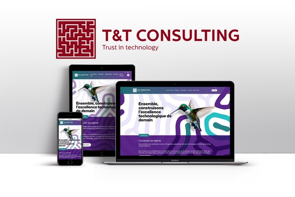
Refonte du site internet de T&T Consulting
La société T&T Consulting, Groupe NORDWAND, est une société de conseil en Télécommunications, Réseaux et Systèmes d’Information qui depuis plus de 26 ans réalise des projets à forte valeurs ajoutée sur les secteurs des Télécoms / Transports / Défense-Energie.
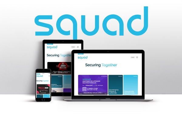
Refonte du site internet du groupe Squad, acteur majeur de la cybersécurité
Depuis sa création, le Groupe Squad s’est imposé comme un leader en cybersécurité. Avec 1000 collaborateurs et près de 130 Millions d'Euros de chiffre d'affaires, le Groupe Squad fait partie des premières forces cyber de France.
Nous contacter
- contact@emencia.com
- +33 1 47 20 23 01
- 117 rue de Charenton, 75012 Paris France